

Practice visual rules
The SVG markup and Markdown that Hephaestus accepts in a practice visual and guide, the theme color classes, and the starter templates.
This page lists what Hephaestus accepts in the visual and the guide of a practice. Hephaestus checks each visual, guide, and figure when you save the practice. If it refuses the save, its message names the element, the attribute, or the limit. Practices gives the steps to add a visual and a guide.
What Hephaestus accepts
| Rule | Limit |
|---|---|
| Root element | <svg xmlns="http://www.w3.org/2000/svg" viewBox="…"> |
| File size | 64 KB or less for each SVG |
| Elements | svg, g, path, rect, circle, ellipse, line, polyline, polygon, text, tspan, title, desc |
| Attributes | Geometry and presentation only. The list follows this table. |
| Attribute values | Letters, digits, spaces, and the characters # . , % + ( ) / - _. Thus, a value cannot contain a url(...) reference, a quote, or an escape. |
| Not accepted | Ids, the style attribute and element, links, a DOCTYPE, scripts, images, CDATA sections, processing instructions, and comments that contain < or > |
| Visual description | 1 to 300 characters |
| Guide text | Markdown with no HTML, 12,000 characters or fewer |
| Links in a guide | Web addresses that start with https:// or http:// |
| Figures | 4 or fewer for each guide. A figure name has lowercase letters, digits, and single hyphens. |
| Images in a guide | Only the guide's own figures, each with a description and the source figures/<name>.svg. Add figure writes this line for you. |
The accepted attributes are:
viewBox, width, height, preserveAspectRatio, version, x, y, x1, y1, x2, y2, cx, cy, r, rx, ry, d, points, dx, dy, transform, class, fill, fill-rule, fill-opacity, clip-rule, stroke, stroke-width, stroke-linecap, stroke-linejoin, stroke-miterlimit, stroke-dasharray, stroke-dashoffset, stroke-opacity, opacity, font-size, font-weight, font-style, text-anchor, dominant-baseline, letter-spacing, vector-effect, role, aria-hidden, focusable, and xml:space.
Most drawing tools add ids, styles, or gradients. Remove them before you upload the file. Without ids, a picture cannot use markers, gradients, masks, filters, or clip paths. Draw an arrowhead as a small filled triangle.
Colors in light and dark mode
A pv-* class gives a shape a color of the app theme.
The color changes with the theme, so one file works in both themes.
| Class | Color |
|---|---|
pv-fill-ink | Fill with the main text color |
pv-fill-muted | Fill with the secondary text color |
pv-fill-surface | Fill with the panel background |
pv-fill-accent | Fill with the accent color |
pv-fill-accent-soft | Fill with the accent color at 15% opacity |
pv-stroke-ink | Stroke with the main text color |
pv-stroke-muted | Stroke with the secondary text color |
pv-stroke-line | Stroke with the border color |
pv-stroke-accent | Stroke with the accent color |
pv-mono | The code font of the app, for one code token in a label of size 15 |
Set fill="none" on a shape that has only a stroke.
A visual with no pv-* class keeps its own colors.
The panel shows it on a light surface in both themes.
Starter templates
Each template uses only accepted markup and pv-* classes, with placeholder labels:
- Contrast pair: the work without the practice on the left, and the same work with it on the right. Use it unless a fork or a sequence fits better.
- Fork: one event, then the lapse on top and the practice below.
- Sequence: three steps in order, for a figure in a guide. A visual uses it only to compare two orders, as two rows.
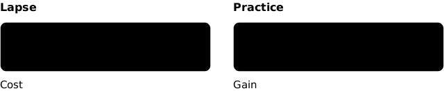


A copy of a template can be edited in a text editor or a drawing tool.
The height of its viewBox must reach the bottom of the lowest shape.